Hi Peter, all I can do is compare to other photos, so if you look at your daughter 2013/09 and ‘Garden’ first she has an orange tint (i think less natural) in the shadows compared to the bluer tint in the 2013. Also the greens shadows, are a cooler darker in the 2013 where it’s more greeny/yellow the 2020 version. Different time of year, but much prefer the 2013 (prob M9) tones. I think if you can nail the orange/pink skin colour cast & cool off the shadows more, I personally would prefer these colours (only my humble opinion!)
Thank you for making the effort to point out the differences. I see what you mean, but all the images from September 2013 were taken in a different location with different lighting. Apples to oranges, as they say.
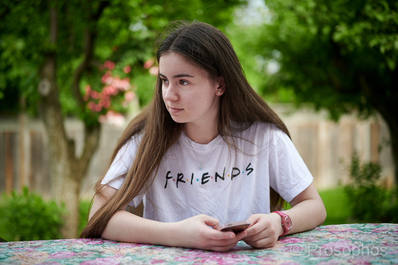
I really like the green tones in the image above, which I know are warmer as they were influenced by direct sunlight. They look garden-ish, if you know what I mean.
I concede however that colour appreciation is a very subjective thing.
As for “pop”, you haven’t commented yet…
Sure about the greens, but just the skin pinky cast? (I commented on previous post for pop) Cheers
It’s a work in progress 🤷🏻♂️.
Incidentally, the June posts represent my first foray into using Capture One and RAW files from the Z7. Thanks again for your feedback.
No worries. Let me know how you get on with Capture One, I’m still Lightroom 6.14!
That’s what I was using up until 48 hours ago! That’s also why I couldn’t process RAW files from the Z7 until now. No subscriptions for me, so I guess it’s the end of the line for LR and me. I’m really liking Capture One.
Incidentally, I missed out on the sale that was going on recently on Capture One (via B&H) so I ended up buying the Nikon-only version. In retrospect, it was a good move since the stand-alone license for perpetual use is priced reasonably and I’m only shooting with Nikons these days anyway.
The tools for colour control in C1 are quite sophisticated, but I don’t see myself applying corrections to the degree I used to… I want photography to be fun again.
ha ha, yes I also took liberty with the (covid) sales and bought myself Affinity photo. As you say, I’m also trying to kick the Adobe habit, so Affinity for final touch up / small item removal is astoundingly good for the money. (Capture one will have to wait until Apple force me to upgrade to Catalina!)
Continuing this thread… I just had a look at my images on my iMac and was shocked to see on Firefox that the colours are definitely more warm/pink. They look quite different/unnatural as compared to what I see on my laptop. Even in LR/Capture One the images look less pink, regardless of whether they are being viewed on my laptop or iMac. I guess Firefox renders in a different way… Man, this complicates things. I think maybe I’m going to just do B&W conversions from here on end, LOL.
UPDATE: I decreased the pink/orange hues and uploaded the new version. You may need to refresh your browser to see it.
Happy Birthday!
So, I deffinately think the colours are better, still think the shadows are still slightly too pinky. I also checked your browser observation, on my Mac, Firefox vs Safari, they definately render differently. The colour didn’t change, but the contrast certainly did. Firefox renders slighly lighter, and you can definately see this in the dark areas (slightly lighter) Interesting observation, though the colours didn’t change (on my monitor) Do you calibrate your monitors? I’ve had to buy a Colormunki, as was getting terrible prints. This fixed it (though on that note, check everything is in sRGB/8bit, as had a nightmare with colour space across kit)……it never ends!


Hi Peter, all I can do is compare to other photos, so if you look at your daughter 2013/09 and ‘Garden’ first she has an orange tint (i think less natural) in the shadows compared to the bluer tint in the 2013. Also the greens shadows, are a cooler darker in the 2013 where it’s more greeny/yellow the 2020 version. Different time of year, but much prefer the 2013 (prob M9) tones. I think if you can nail the orange/pink skin colour cast & cool off the shadows more, I personally would prefer these colours (only my humble opinion!)
Thank you for making the effort to point out the differences. I see what you mean, but all the images from September 2013 were taken in a different location with different lighting. Apples to oranges, as they say.
I really like the green tones in the image above, which I know are warmer as they were influenced by direct sunlight. They look garden-ish, if you know what I mean.
I concede however that colour appreciation is a very subjective thing.
As for “pop”, you haven’t commented yet…
Sure about the greens, but just the skin pinky cast? (I commented on previous post for pop) Cheers
It’s a work in progress 🤷🏻♂️.
Incidentally, the June posts represent my first foray into using Capture One and RAW files from the Z7. Thanks again for your feedback.
No worries. Let me know how you get on with Capture One, I’m still Lightroom 6.14!
That’s what I was using up until 48 hours ago! That’s also why I couldn’t process RAW files from the Z7 until now. No subscriptions for me, so I guess it’s the end of the line for LR and me. I’m really liking Capture One.
Incidentally, I missed out on the sale that was going on recently on Capture One (via B&H) so I ended up buying the Nikon-only version. In retrospect, it was a good move since the stand-alone license for perpetual use is priced reasonably and I’m only shooting with Nikons these days anyway.
The tools for colour control in C1 are quite sophisticated, but I don’t see myself applying corrections to the degree I used to… I want photography to be fun again.
ha ha, yes I also took liberty with the (covid) sales and bought myself Affinity photo. As you say, I’m also trying to kick the Adobe habit, so Affinity for final touch up / small item removal is astoundingly good for the money. (Capture one will have to wait until Apple force me to upgrade to Catalina!)
Continuing this thread… I just had a look at my images on my iMac and was shocked to see on Firefox that the colours are definitely more warm/pink. They look quite different/unnatural as compared to what I see on my laptop. Even in LR/Capture One the images look less pink, regardless of whether they are being viewed on my laptop or iMac. I guess Firefox renders in a different way… Man, this complicates things. I think maybe I’m going to just do B&W conversions from here on end, LOL.
UPDATE: I decreased the pink/orange hues and uploaded the new version. You may need to refresh your browser to see it.
Happy Birthday!
So, I deffinately think the colours are better, still think the shadows are still slightly too pinky. I also checked your browser observation, on my Mac, Firefox vs Safari, they definately render differently. The colour didn’t change, but the contrast certainly did. Firefox renders slighly lighter, and you can definately see this in the dark areas (slightly lighter) Interesting observation, though the colours didn’t change (on my monitor) Do you calibrate your monitors? I’ve had to buy a Colormunki, as was getting terrible prints. This fixed it (though on that note, check everything is in sRGB/8bit, as had a nightmare with colour space across kit)……it never ends!