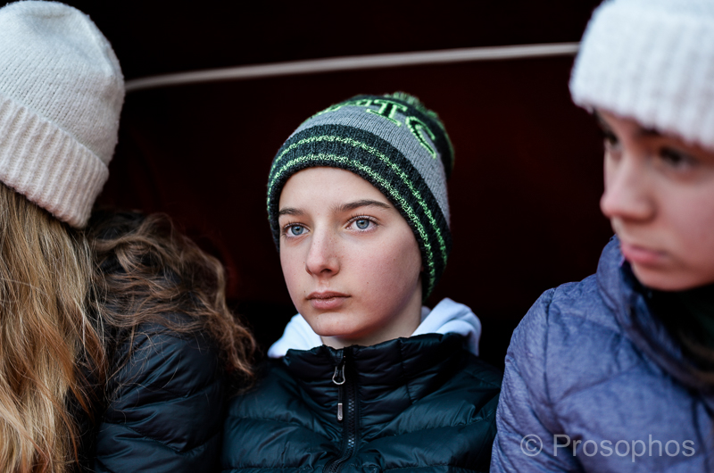
In follow up to the Voigtlander 40/1.4 post, where I evaluate central sharpness on the Nikon Z7 at various lens apertures, here’s what the Nikon 50/1.8S lens does wide open @ f/1.8:
–
Clearly, this lens is operating on another optical level (the advantages of newer lens design and manufacturing, software trickery, as well as a larger size).
—Peter.


Hi Peter, just a general comment. When I look back across your older (mainly leica pictures) I just miss those tones and pop. I find the Nikon colours, rather flat and with odd tints and hues & generally a bit ‘off'(either a bit greeny or the highlights just flat) The actual photos are great, but I’m just not liking the colour (both on the Nikon and voight lenses, so it’s not them) duno what you think (this is only an observation, I’m not trying to be critical) I’m veiwing on a calibrated sRGB monitor, so my colours should be good. Hope you don’t mind me saying.
I don’t mind your comment at all!
I’d have to see which photos you consider among some of the best, colour wise, in order to offer some specific insight.
In the interim, I will say a few things that might shed some light:
I’ve been using a lot of film presets, which tend to have funky colour casts. Again, this has been a time-saver, but the lack of quality shows.
Currently, I’m shooting JPG files (sorry to everyone!), and not just regular JPGs but the “Flat” version of the Nikon Picture Control (which are even more washed out than the “Neutral” option).
Having said that, the photo I posted above (actually, re-posted, since it was originally posted in the winter) has no issues with colour… IMHO.
Let me know what you think,
―Peter.
HI Peter
Your use of presets and jpgs might explain it. So for example, compare ‘Honey’ May 27th with 2012/10 Honey. 2020 honey is pinky/magenta where as 2012/10 has a cooler cast & the browns are much nicer. ‘Watching’ has got a weird tint, especially on the highlights, same for ‘Homework’ I think ‘Feels like spring’ your daughter in the green top, her skin tones are just strange (She is in shadow, but flat and pinky/magenta tint) compare that to ‘sisters’ 2014/07 it’s just night and day in terms of colour. I could go on, but you get my point. Concerning ‘As a point of comparison’ yes this better, but I still think the shadows on the face are too pink/magenta/orange compare to say ‘windswept’ 2012/08 where the shadows have a nicer blueish tint and highlights more warm/yellow.
Phew! anyway think I get my observation across. Maybe it’s my taste, duno (I did have an M9, now a Sigma fp) but for me the right colour make me the most happy (more than sharpness or composition) cheers Peter
Have a look at the posts following this one (June 1st and onward) and let me know what you think.